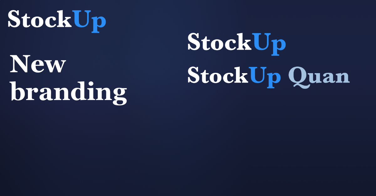
From day one, our mission at StockUp has been to make institutional-grade financial analysis accessible, precise, and fast. As our platform has expanded, and as our specialized financial AI model, Quan, has evolved into a premier tool relied upon by retail investors, developers, and enterprise teams alike, we realized that our visual identity needed to mature alongside our technology.
Today, we are thrilled to unveil a significant update to the visual brand identity of both StockUp and Quan. This rebrand introduces a cleaner, more serious visual presence designed to reflect the caliber of our users and our long-term commitment to leading the financial AI space.
A Mature, Serious Identity for Serious Financial Technology
At the center of this rebrand is our new logo. We have moved away from our original branding to a much more mature, serious font. This change addresses a visual gap: our back-end model capabilities were advanced and institutional-grade, but the brand styling felt more like a casual consumer startup.
This new, polished typography gives StockUp and Quan the serious, stable, and highly professional look that they deserve. When analyzing markets, parsing complex SEC filings, or integrating APIs into production enterprise stacks, trust and reliability are paramount. Our refreshed brand identity visually mirrors that exact sense of precision and duty.
"As StockUp scales to support professional research desks and complex corporate pipelines, our visual identity must command the same respect as the models we build. This new logo typography gives us the serious look needed for our next phase of growth."
True to What We Are
While the typography and brand marks have evolved, we remain entirely true to the core identity that our community has built with us. We have made no adjustments to our color palette: the signature StockUp blue and Quan purple remain the anchor points of our interfaces.
We believe in building iteratively and focusing on real substance. We didn't change our colors or alter our fundamental design system just for the sake of novelty; instead, we refined the logo and presentation elements to let the actual platform shine through more clearly. It is still the StockUp you know and trust, but presented with a much cleaner and more professional finish.
Powering Our Future Growth
This rebrand is a launchpad. Elevating our visual brand to a professional tier makes StockUp a natural choice for institutional integrations, corporate partnerships, and large-scale enterprise deployments. By aligning our design language with industry standards, we are removing barriers to adoption and positioning StockUp to grow rapidly in the financial technology sector.
Our commitment remains absolute: we will continue to build the best, most professional Financial AI available. From the deep analytical capabilities of Quan 3.4 to our newly launched API Enterprise tiers, this brand evolution is just the visual representation of the intense technical momentum happening behind the scenes.
Thank you for being part of our journey. We look forward to continuing to build the future of financial intelligence under this clean, mature new banner.